PROJECT BACKGROUND
Big data is inconceivably massive, imprecise, and incomplete. Tamr’s data unification platform delivers clean, curated data critical to optimizing key insights.
While Tamr’s software is useful, it is also complex. My team was tasked to improve how potential customers learn about their product’s value.
How can we redesign the site to enable users to understand how Tamr can solve their business problems?
PROJECT DETAILS
Focus
Research, UX, Web Design
Scope
Three-week-long client project working on stakeholder and user research, usability testing, and iterative web design
Tools
Sketch, Invision, Adobe Illustrator
THE CURRENT SITE
The first thing we noticed about Tamr’s site was the lengthy homepage, which requires the user to scroll five times to locate valuable information about the product. We determined that the homepage must be adjusted to effectively guide the user to the Solutions page.
The navigation within the Solutions pages lacks a linear flow and guides the user to inconsistent endpoints. The menu items are esoteric and unaccountable, preventing the user from understanding the company’s value.


STAKEHOLDER INTERVIEWS
We held key stakeholder interviews with the sales, marketing, and design teams to better understand their goals.
What is the purpose of the site?
What information is necessary to communicate to the user?
KEY TAKEAWAYS
The Tamr site should:
Offer prospective clients an overview of the company and its product
Enable prospects to navigate and understand applicable solutions
Convey technical sophistication and thought leadership in data integration with focus on solving business problems
Encourage users to schedule a demo
USER INSIGHTS AND PERSONAS
We learned through our stakeholder interviews that Tamr’s target users are data scientists and business executives.
USER INTERVIEWS
We interviewed 11 target users, including 8 data scientists/analysts and 3 business executives. We wanted to understand how they would learn about Tamr and its product, what information they find useful, and how they would navigate the current Solutions pages.
KEY TAKEAWAYS
Company mission and product value not obvious to users
Confusion over the name of the product
Main navigation bar is misleading and unclear
Amount of information on the Solutions catalog is overwhelming and inconsistent
Visuals do not always complement the text
THE PROBLEM
We gathered that prospective customers are unable to easily understand what the company does, as well as what solutions it offers. The content is overwhelming and the user flow is not intuitive. With more straightforward explanations and a better information hierarchy, the user flow will be more intuitive and thus help users understand Tamr and its product.
THE SOLUTION
We design an informative homepage to allow users to gain a high-level understanding of Tamr and its product. In addition, we redesign the existing Solutions navigation and pages to encourage users to explore more applicable solutions.
IDEATION
While data analysts were using the site to gain in-depth understanding of the company and its product, executives were focused on what value and benefits Tamr’s platform would add to their business.
With this in mind, we held a design studio and compared our sketches. We agreed on the following changes:
Reorganize the order of information presented; prioritize the product over the customer testimonials: users want to know what Tamr did before reading about their current customers
2. Eliminate the solutions dropdown menu to encourage self education; divide solutions into a two card navigation system: by use case and by industry. Users will be driven towards relevant solutions and applicable case studies
3. Reduce the amount of text with one-sentence overviews; rework current paragraphs to highlight Tamr’s capabilities
USER FLOWS
We created two user flows to display the potential user routes. The first user flow shows the route in which a user would navigate potential solutions by industry. The second flow displays a more involved discovery process, where the user watches the introductory video, looks at the product, and then navigates potential solutions by use case. The user looks at the customer insights and testimonials and ultimately schedules a demo.
HI-FI ITERATIONS
Homepage
The new homepage prioritizes Tamr’s capabilities with a straightforward byline and intuitive hierarchy.
The asymmetrical shapes encourage additional scrolling for more natural information discovery.
Solutions Landing Page
The two card solutions navigation system optimizes the user’s route to finding their potential solution.
We went through several iterations, testing the breadth and depth of the displayed solutions.
V1
V2
V3
Solutions Navigation
The user then chooses solutions by industry or use case. The card design follows the pattern of the previous page.
Our first iteration displays the category and a relevant icon. Following user testing, we decided that the cards should provide a high-level description of each sector to more effectively guide the user to their applicable solution.
V1
V2
Solutions Pages
Customer Insight Page
We reduced the amount of text on the Customer Insight Page to highlight major points.
This includes an interactive toggle element that highlights the benefits of Tamr’s product.
We created example pages that could be used as templates across all of the solutions.
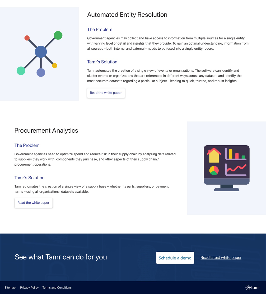
The Government Page is organized into four example problems. The redesign includes more whitespace, better iconography, and offset text to make the amount of information more digestible.
LOGO DESIGN
Over the course of our engagement with the client, they shared with us their interest in animating their company logo. I drew inspiration from their mission to unify data, iterating upon their current logo.
DESIGNING TO SHOWCASE PRODUCT VALUE
After several rounds of usability testing with our target user group, we found that our site redesign successfully met the users' needs by crafting clear messaging around the company and its product, providing an intuitive path to relevant solutions by industry and by use case, and illustrating real, powerful success stories.


