
PROJECT BACKGROUND
The MET’s current native mobile app does not adequately support the experience of visitors at the museum. The MET would like to expand their app to include additional information and more engaging content.
How can we increase app engagement without distracting the user from the museum experience?
PROJECT DETAILS
Focus
UX, Mobile Design
Scope
Two-week-long group project researching, wireframing, prototyping an iterative mobile design
Tools
Sketch, Invision, Adobe Photoshop
CURRENT APP
Screenshots of current MET app (iOS)
PROS
Consistent use of color palette, taxonomy, and typography
Focuses on the artwork
Solid list of feature ideas
Good product offering
CONS
Lacks real-time engagement
Hybrid
Overall design feels flat
Map is unresponsive and not intuitive
Phantom customization
Unclear labeling
USER INTERVIEWS
What information does the user want access to before/during/after their visit?
How do users engage with artwork at a museum?

Affinity Map
KEY TAKEAWAYS
A museum’s native mobile app should ideally:
Provide user-friendly wayfinding in real-time
Enable and encourage visitors to personalize their experience
Provide detailed information on art
THE PROBLEM
Users of the MET app need a way to curate an interactive experience based on their interests, navigate the museum more efficiently, and access detailed information on artwork in real time.
THE SOLUTION
Adding an interactive wayfinding feature to the current mobile MET app will allow users to easily navigate and curate a custom tour of the museum.

Feature Prioritization Matrix
USER INSIGHTS AND PERSONAS
We developed three personas to reflect the various needs of museum visitors.


PROTOTYPING

Lo-fi prototype
USER TESTING
We conducted user tests with paper prototypes made from wireframes on Sketch.
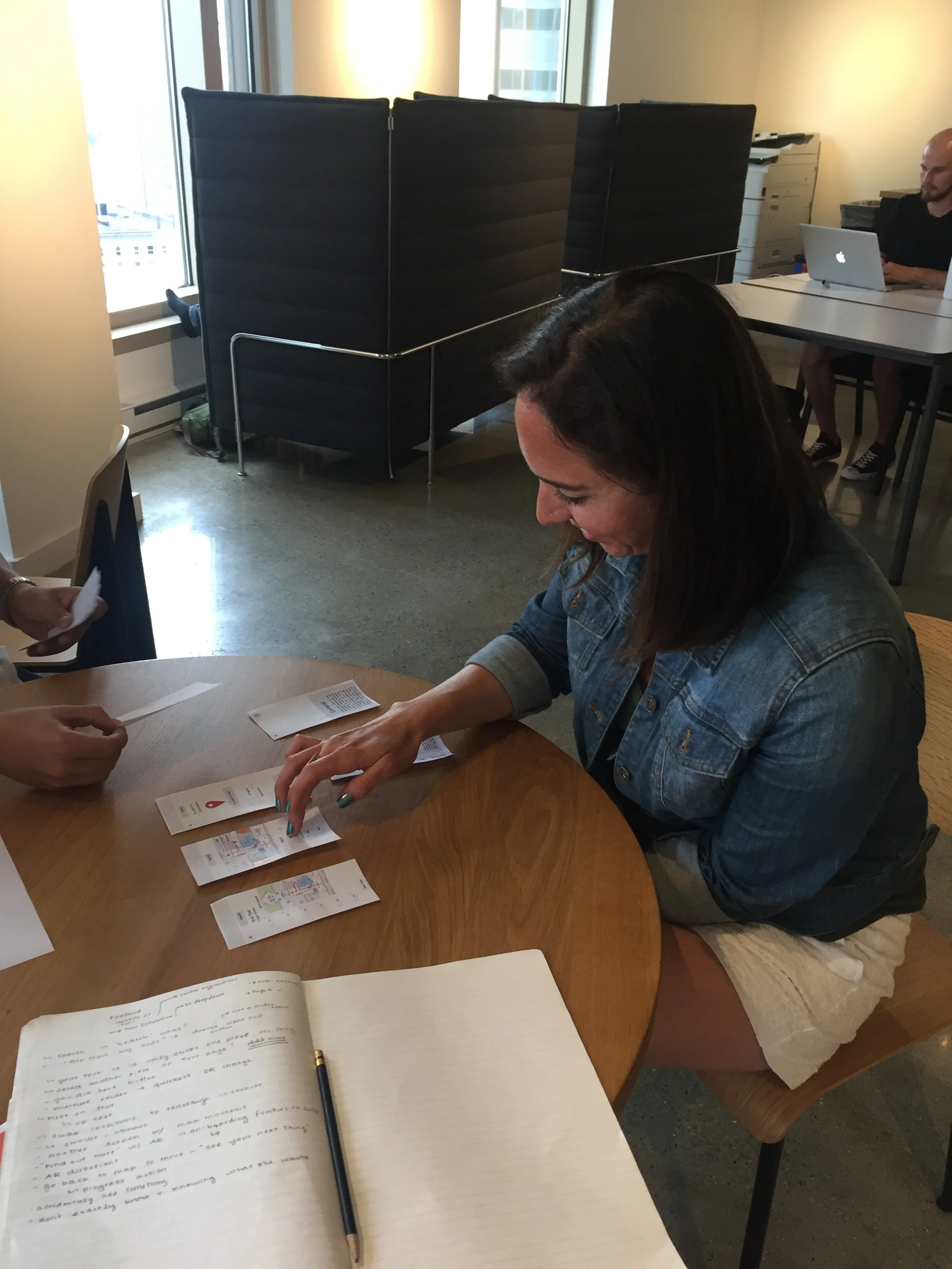
User testing

Paper prototype
KEY TAKEAWAYS
Search and scroll bars were unclear and extraneous; did not properly convey the context
User location on the map unclear, no form of communication (vibrating, voice, notifications)
Unnecessary prompt regarding children, should be able to opt-in to kid-friendly option
Liked the opportunity to save favorite pieces and exhibits, but unclear how these would affect future suggestions
Enjoyed that they were encouraged to browse the museum via suggested tours as well as view detailed information on artwork
AR feature and interactive map greatly improved wayfinding, but needed an onboarding component
ORGANIZATION AND FLOWS
With these insights in mind, we created an app map and user flow to guide the high fidelity prototypes.

App map

User flow
HI-FI MOCKUP

Home Screen
The home screen presents the user with the option to search the museum, scroll through previously saved favorite artwork, and view a carousel of recommended tours.

More Tours
The “More Tours” button leads the user to a scrollable list of available tours on the app.

Tour Overview
This screen displays tour details and a description. Users have the option to view related tours or proceed with the selected tour.

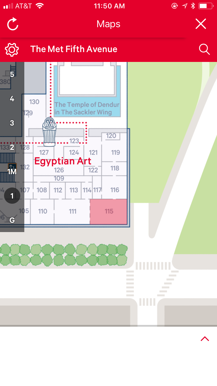
Tour Map
The map shows the tour route as well as the user’s location in real-time. The user can view tour highlights, upcoming exhibitions, and crowd size. There is a fixed restroom button in the top right corner that locates the nearest facilities.

AR Launch
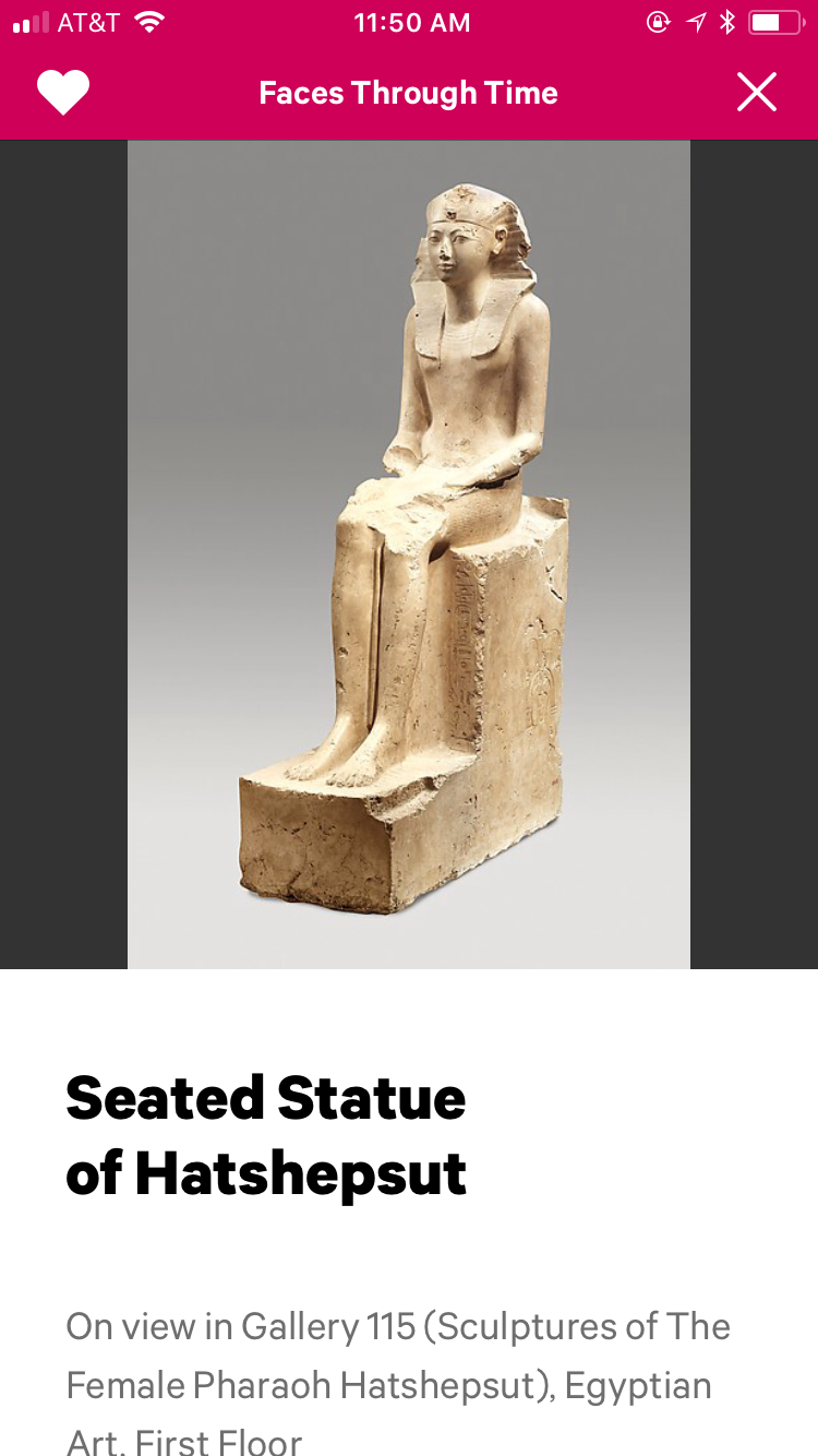
The AR feature launches when the user arrives at a stop on the tour.

Details
The app recognizes the work and displays detailed information.

Favorites
The user is able to favorite a piece of work for future viewing.